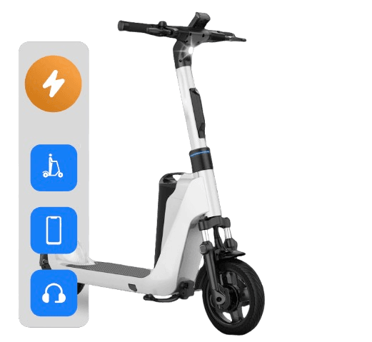
SCOOTSEE
Scootsee is a Canadian smart mobility startup providing electric scooter-sharing services. We helped launch their brand from scratch - building everything from the name and identity to the full website and marketing materials.

Details About The Project
Scootsee was starting from zero - no brand, no visuals, no platform. We helped them build a full digital identity and presence to support public launch, media outreach, and future investor alignment.
Scope
- Naming consultation and brand messaging
- Website design & development
- Launch strategy & marketing collateral
- Scalable CMS & performance optimization
A Comprehensive Revamp
We weren't just designing a website — we were launching a brand. The challenge was to bring Scootsee to life as a credible, smart, and accessible solution for city mobility.
We Focused On:
- Building visual & verbal identity from scratch
- Creating scalable page design for riders and partners
- Establishing user trust through thoughtful UX and clean Ul
- Delivering in a tight pre-launch timeline
Challenges
- Brand had no previous visual assets
- Unclear user journey or brand messaging
- Needed to serve multiple stakeholders (riders, cities, investors)
Our Role
- We led the end-to-end strategy & creative execution - turning a game into a brand, and an idea into a digital presence
- Brand idetity (visual + verbal)
- Full UI/UX design
- Webflow website design
- Marketing & PR launch materials
Technical
- The digital experience needed to be fast, clean, and future-proof. We used flexible tools that would allow their internal team to scale later.
- Figma (wireframes, UI kit, prototype)
- Webflow (frontend & CMS)
- On-page SEO structure
- Analytics & lead tracking setup

Laying the Foundation: A Vision Takes Shape
We began with defining brand tone and core architecture. Scootsee needed to feel urban, friendly, and trustworthy.
- Brand language developement (mission, tone, tagline)
- Page architecture around core flows: ride, partner, explore
- Moible-first sitemap and navigation flow
- Hero content blocks crafted for conversion
Creating Marketing Material & Branding
We equipped the Scootsee team with everything needed for launch and early traction
- Logo system and iconography
- Digital color pallete and typography kit
- Social post templates
- Marketing one-pagers and decks
- City partner pitch visuals
- PR graphics and announcements

Website Built
The site was designed to be modular, fast, and rider-friendly. We built a scalable webflow system that their team could update without dev support
Key features:
- Fully responsive layout
- CMS for updates, FAQs, news
- SEO-optimized structure
- Partner-ready and mobile-friendly UX
- Lightweight animations to reinforce modernity
Challenges to Triumphs
In just a few weeks, we brought Scootsee from concept to launch-ready — with a brand identity and digital home that builds trust and traction.
- Built full identity + site in under 5 weeks
- Ready for pre-beta rollout and city partner demos
- Supported marketing and press coverage
- Delivered handover for in-house use
Marketing Strategy & Execution
Our design thinking was rooted in marketing performance and public perception.
- Conversion-first homepage layout
- Flexible landing page structure
- Email outreach content
- Social assets aligned with brand personality
- Press-ready visual kit
Conclusion & Future Growth
Scootsee is now equipped with a professional, scalable brand system — ready to grow across cities, onboard riders, and pitch new partners. Their digital presence reflects their ambition and communicates their values clearly: simple, smart, sustainable mobility.


